Friday, 18 December 2009
USP
My music magazine will be rock and alternative based and aim at an audience of teenage to young adult females. It will be fun and fresh-faced with bright colours without being too ‘bubblegum’ pop. It will appeal to my target audience because other rock music magazines are dark, serious, unlike what I plan to produce, and primarily male targeted.
Thursday, 17 December 2009
Friday, 4 December 2009
Friday, 20 November 2009
Monday, 16 November 2009
Friday, 13 November 2009
Wednesday, 11 November 2009
Wednesday, 4 November 2009
Friday, 23 October 2009
Friday, 25 September 2009
CD Covers
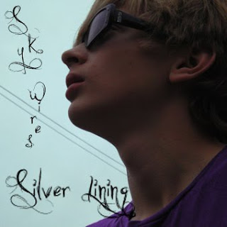
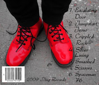
 When I created my CD cover I wanted to make something sort of mellow Rock or Indie. My target audience, therefore, is older teenagers and young adults. I chose bright colours with a dull setting to bring these colours out. I chose the purple and blue on the front and the red from the back and made them brighter and more vibrant whilst dulling down the rest of the images, see *Screenshot 1. This also had the effect that the subject's face on the front is sharper against the dull blue sky.
The pictures are very dreamy and I wanted to keep to this theme with
 the text, both in title and font. I chose soft, swirly fonts, nothing too bold but something which would stand out enough to keep the feel of the music. I used the same font on the back but then found it was too soft and I was losing it to the black of the background, see *Screenshot 2. So I picked a different font which was similar but bolder so the song titles could actually be read.
 *Screenshot 1
 *Screenshot 2
Wednesday, 23 September 2009
Subscribe to:
Comments (Atom)
+copy.jpg)
+copy.jpg)